Ontrack
Treating task paralysis by removing traditional to-do lists
Most productivity apps require active thinking about where tasks should exist - An open-ended system that becomes its own source of stress. To counteract this, I designed a minimal rethink of how tasks should realistically be captured and organised, prioritising active goal setting and progression.
FOCUS
Task management, IA, UX Thinking
AREA OF WORK
Productivity & Wellbeing
ROLE
UX Design & Thinking
Read more
PROBLEM
Lists kinda suck
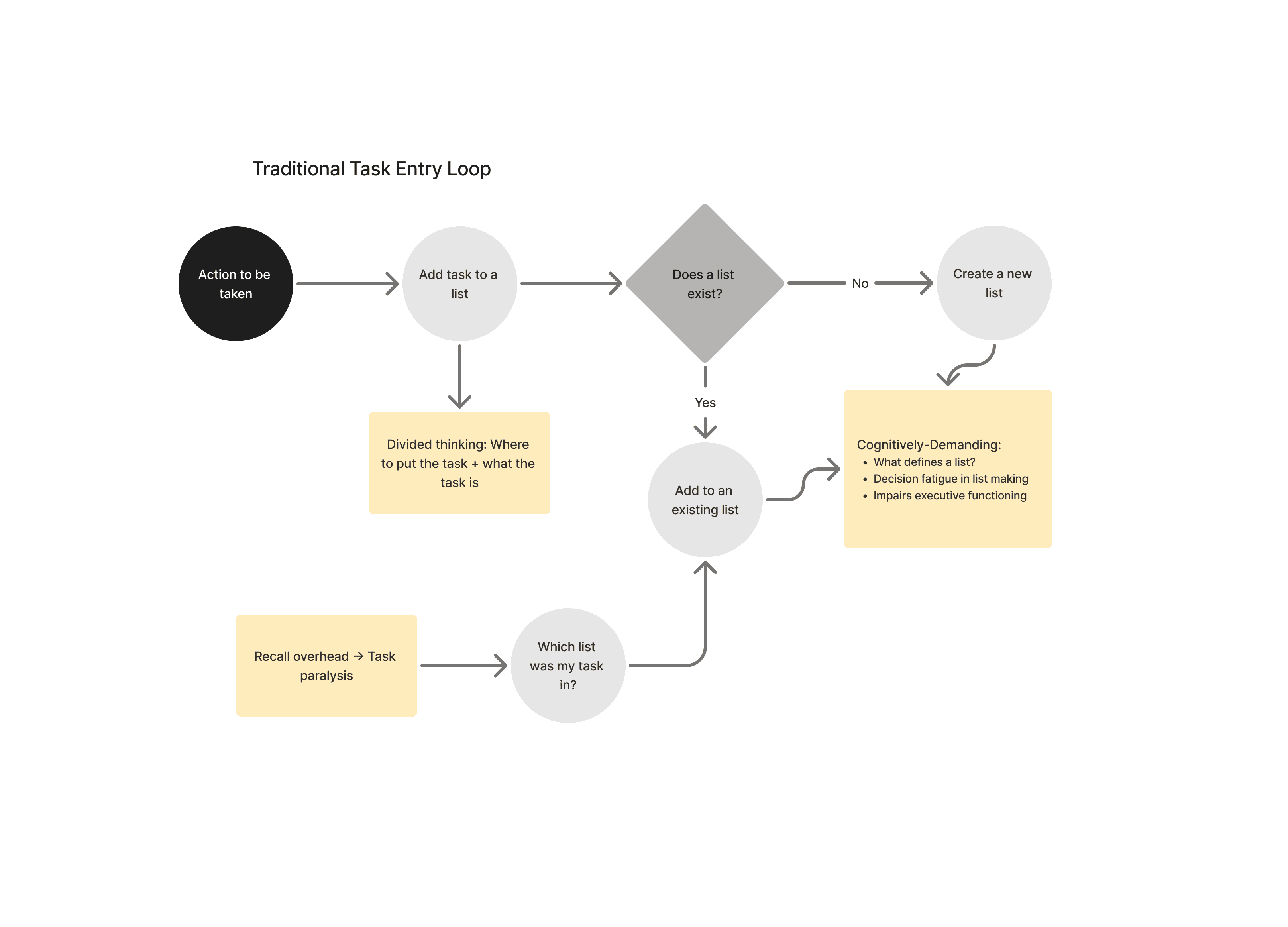
Conventional to-do apps place the full burden of organisation on the user, similar to your computers folder system does. Every task requires a number of decisions: which list does it belong to? Is this list still relevant? Where does this fit relative to other tasks? This might not feel overwhelming at first, but it's common to feel that yours lists grow faster than they shrink and this friction prevents any meaningful work from really being done.
DESIGN APPROACH
Structure that makes organisation simple
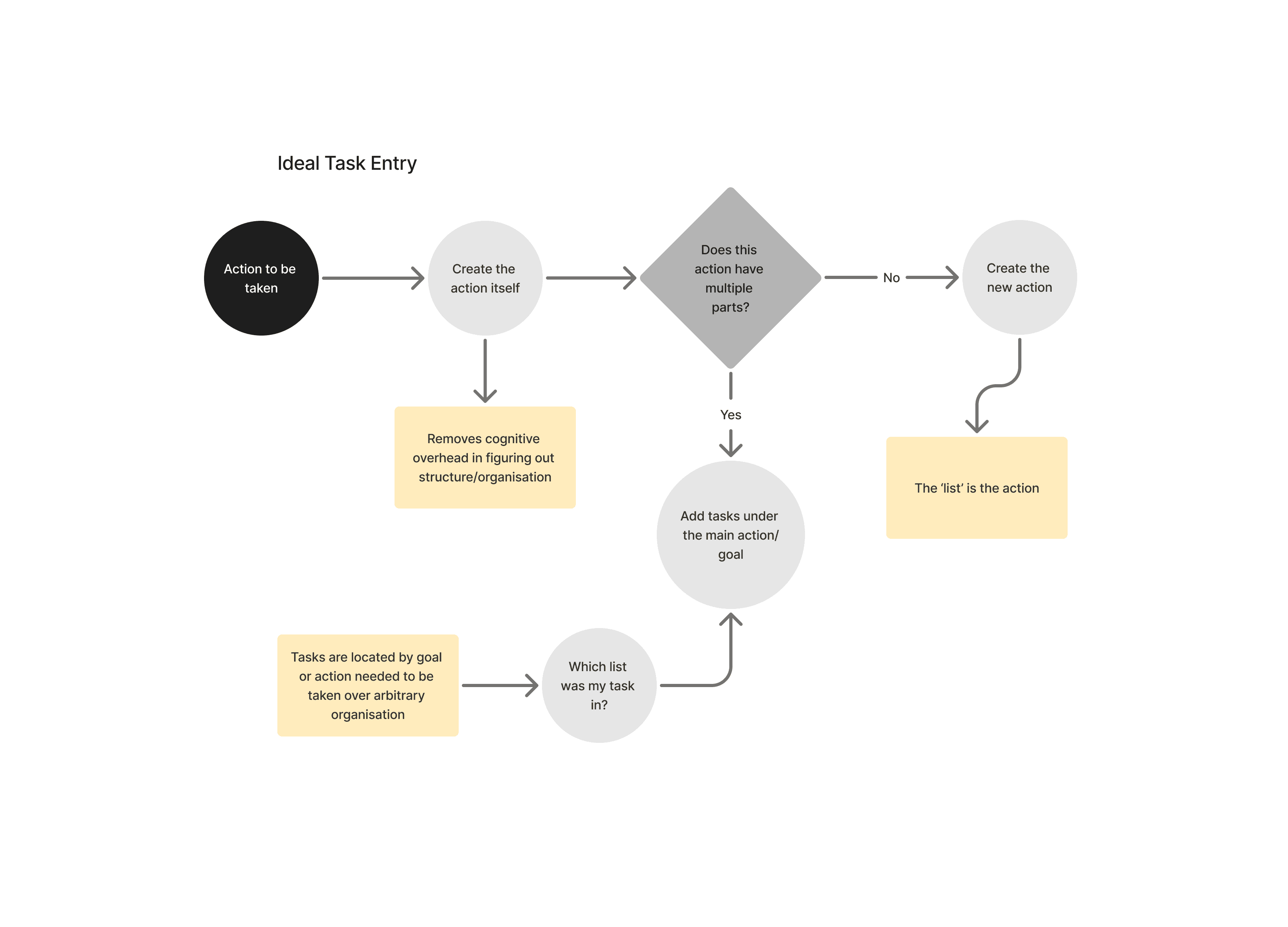
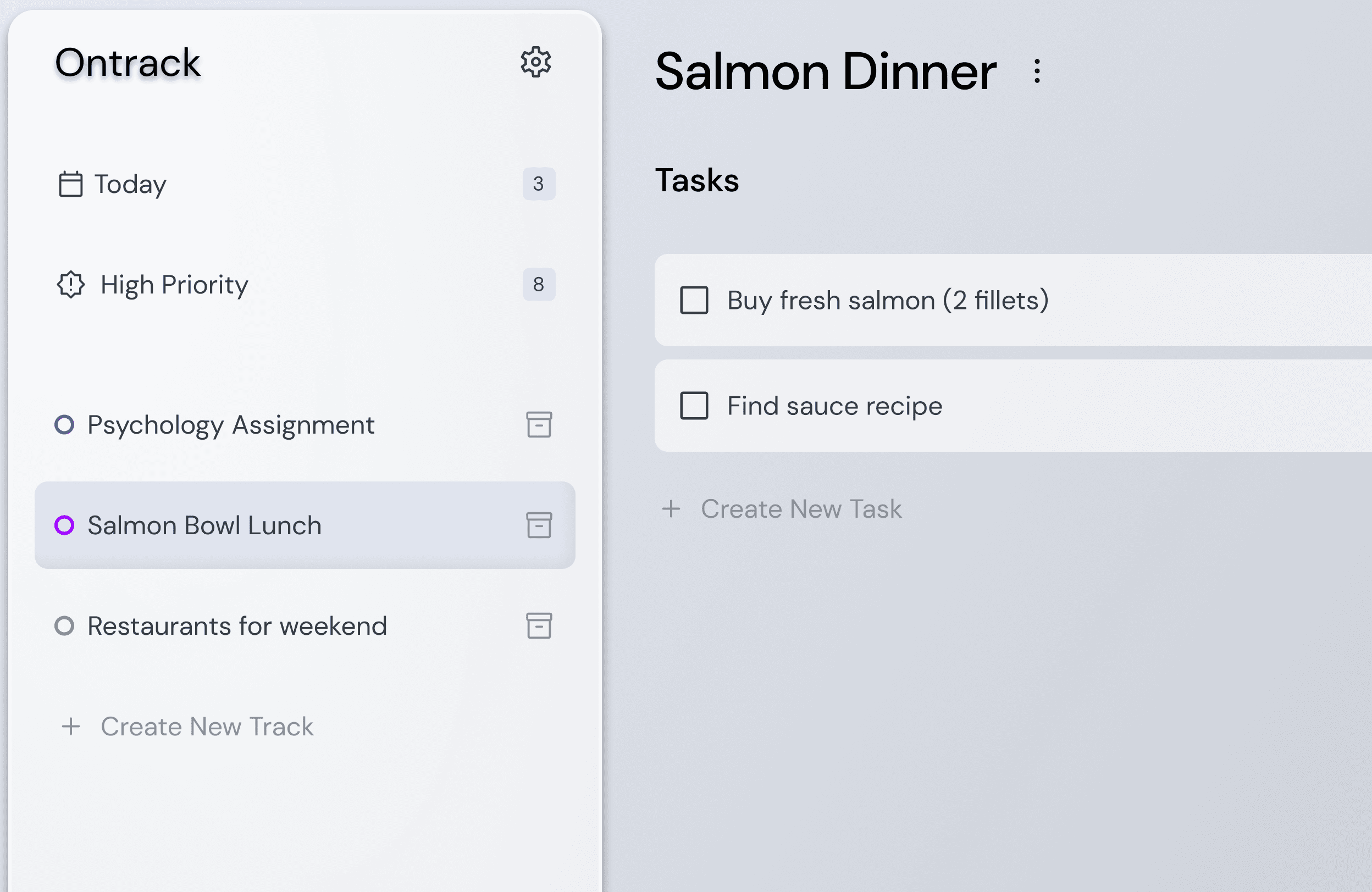
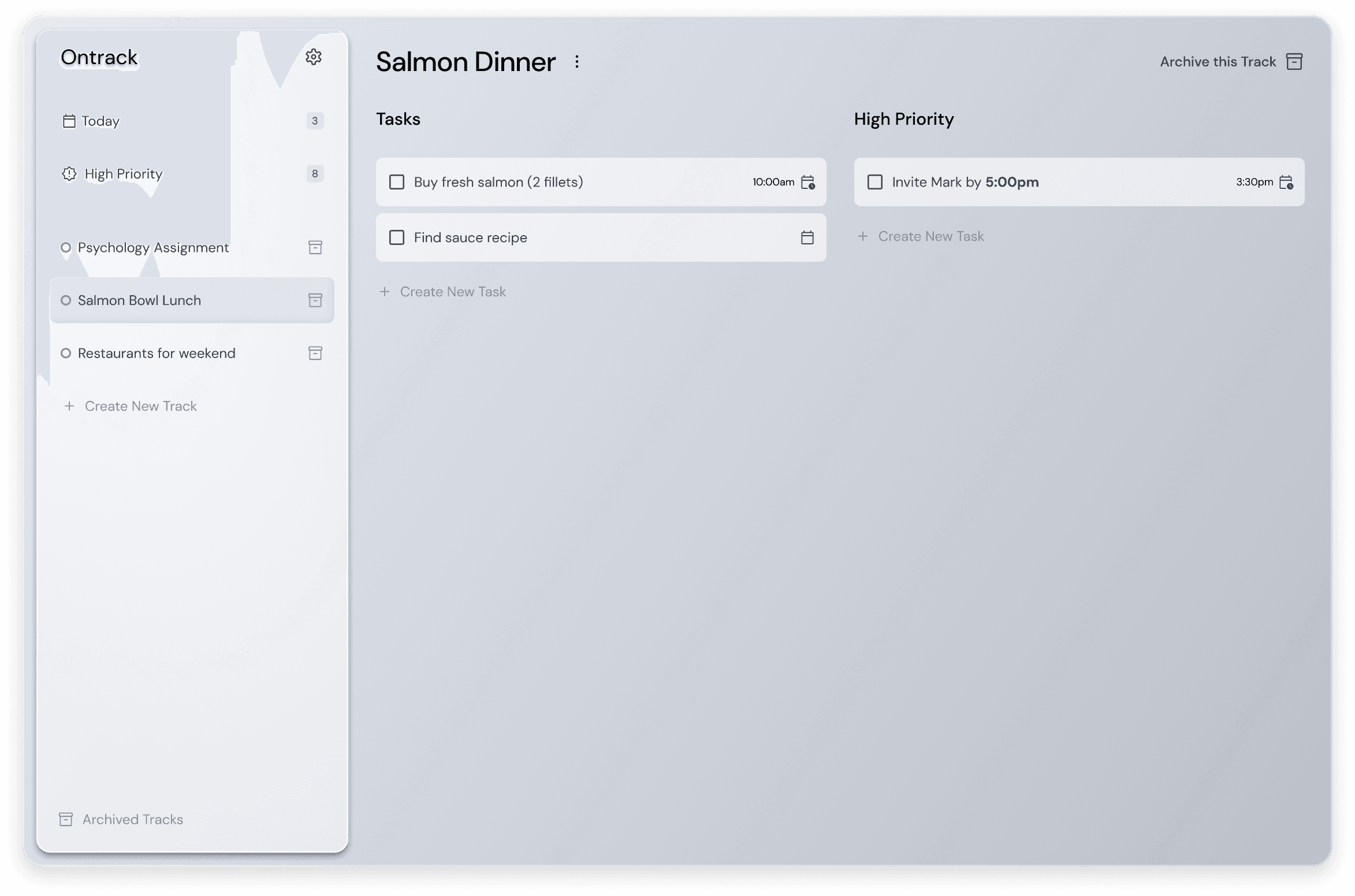
Ontrack introduces a two-tier structure: Tracks and Tasks. The hierarchy is made to flow and make both the capturing and organisation of tasks feel intuitive. Here, organisation at it's core is driven by goals, and any task is an action that needs to take place either on its own as a larger goal, or a smaller part within another goal. Now, every 'list' it's a goal itself, which makes the user experiences tangible progression and can actually achieve a sense of completion.
DESIGN DECISIONS
Small tweaks that reduce friction at every step
Several small decisions compound to create a low friction experience, particularly for users who find that friction early in the flow is enough to make them abandon the tool entirely, or avoid using it overtime. For anyone approaching a new task management tool, they experience the overhead of needing to figure out how tasks are to be organised and management for the unforeseeable future - A very, cognitively demanding task.
OUTCOMES
A system that earns trust by just working
The core principal of the design is that a task manager should feel like relief, not administration. By embedding structure into the model through the bounding of Tracks, visual priority separation, and setting the core user loop to be focused on goal and completion over micromanaging, the app reduces the cognitive overhead of productivity to its minimum viable form thus adjusting for potential task paralysis.
Reduced decision fatigue
Making it easier to start
By removing the need to sort before capturing, users spend less mental energy on organisation and more on doing.
Clearer daily priority
The hardest work, front and centre
Visual separation of high priority tasks means urgent work is never buried beneath a wall of lower-stakes items.
Structure that scales
Without added overhead
The two-tier model stays lightweight as tasks and Tracks grow. The system organises itself rather than asking more of the user.
LEARNINGS
Learnings and Findings
As this was a prototype 1 version of the product, there were some key areas of improvement that could've furthered the core task loop we intended based off the problems discovered.
Dilan Omer © 2026. I had no idea what to include in the footer
